Graphic details in a London’s House for a Stationer
Architecture for London has designed the interiors of this north London extension to appear “like a neatly ruled grid in a notebook”, hinting at the professions of its two inhabitants.
Set on a terrace of Victorian properties in Islington, House for a Stationer has been designed with details that subtly nod to the occupations of its two owners – a stationer and a graphic designer. The rear of the formerly cramped and light-starved house has been extended to make way for an open-plan dining area and study.
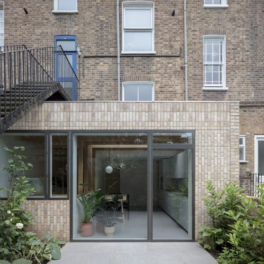
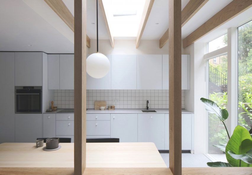
Clad entirely in off-white bricks and fronted by a huge glazed door, the rectilinear volume was constructed to tuck neatly beneath an existing flight of metal steps that connects the upstairs neighbours to their garden. Inside, the extension features an IKEA kitchen suite with pale-grey cupboards. The practice has swapped its original door handles for simple circular knobs, resulting in a more minimal final appearance.
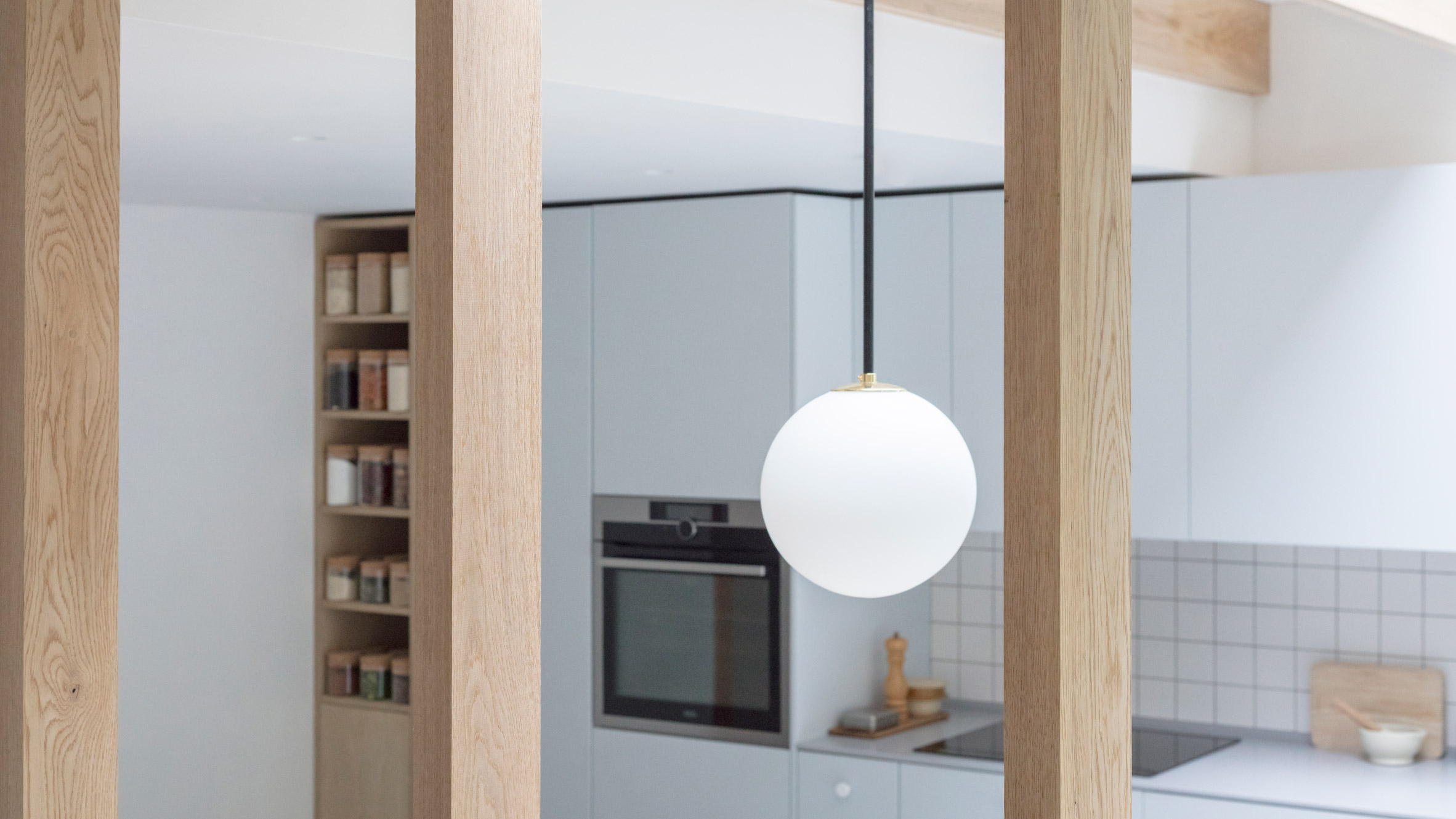
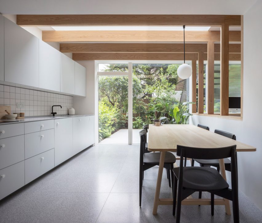
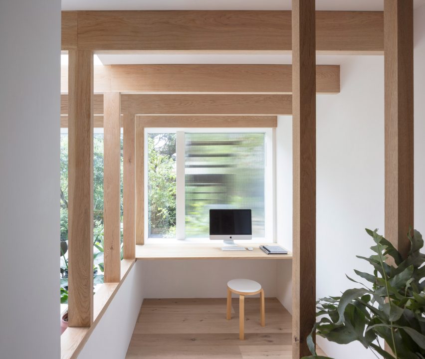
Clean white tiles have been arranged in a grid-like fashion on the rear wall to form a splashback. The linearity of the tiles is matched by raw oak beams that have been placed horizontally across the ceiling and erected vertically to form a partition around the study.
It’s fronted by an in-built wooden desk where the owners can sit and work while overlooking the verdant garden. Fluted glass fitted in the adjacent window helps obscure the unsightly underside view of the stairs outdoors. The extension also boasts a long timber table surrounded by black dining chairs, illuminated from above by a singular spherical pendant lamp. Several potted plants have been dotted around to bring additional greenery indoors.
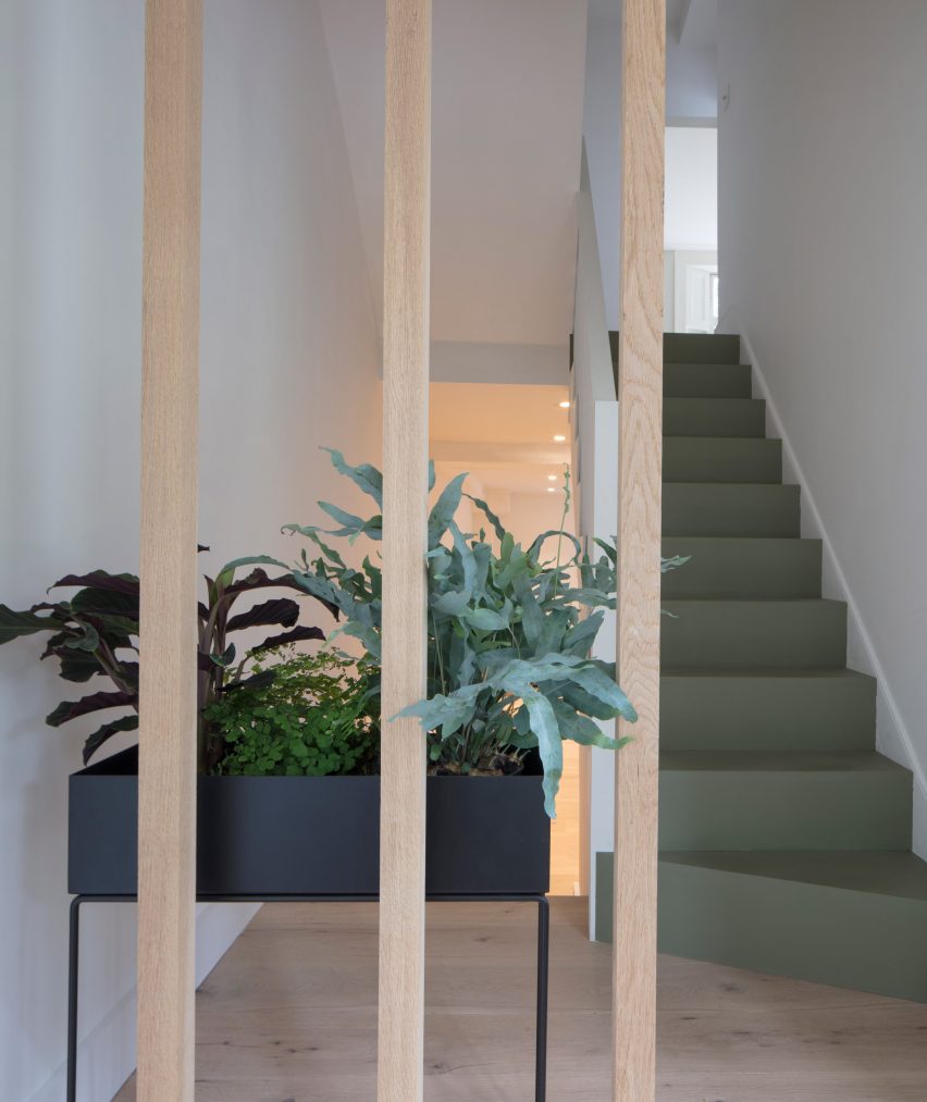
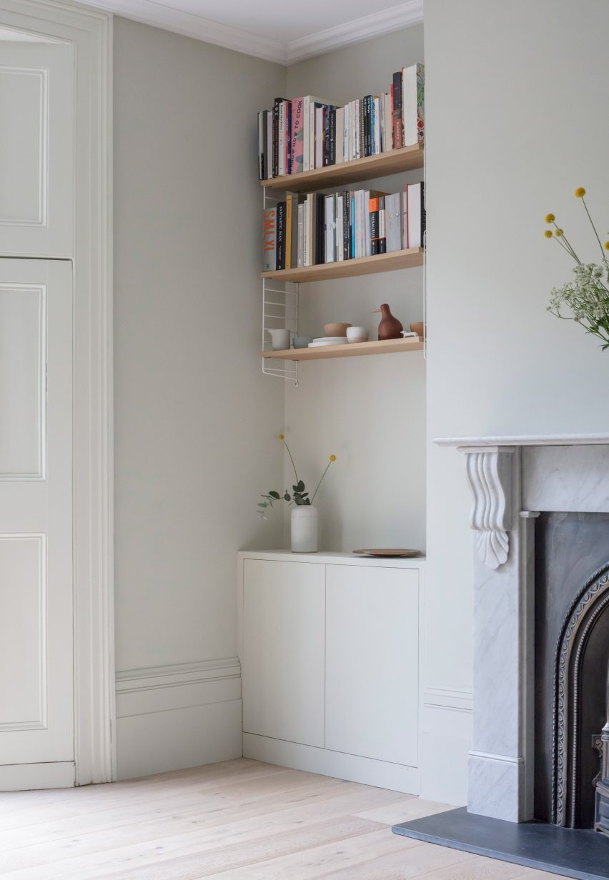
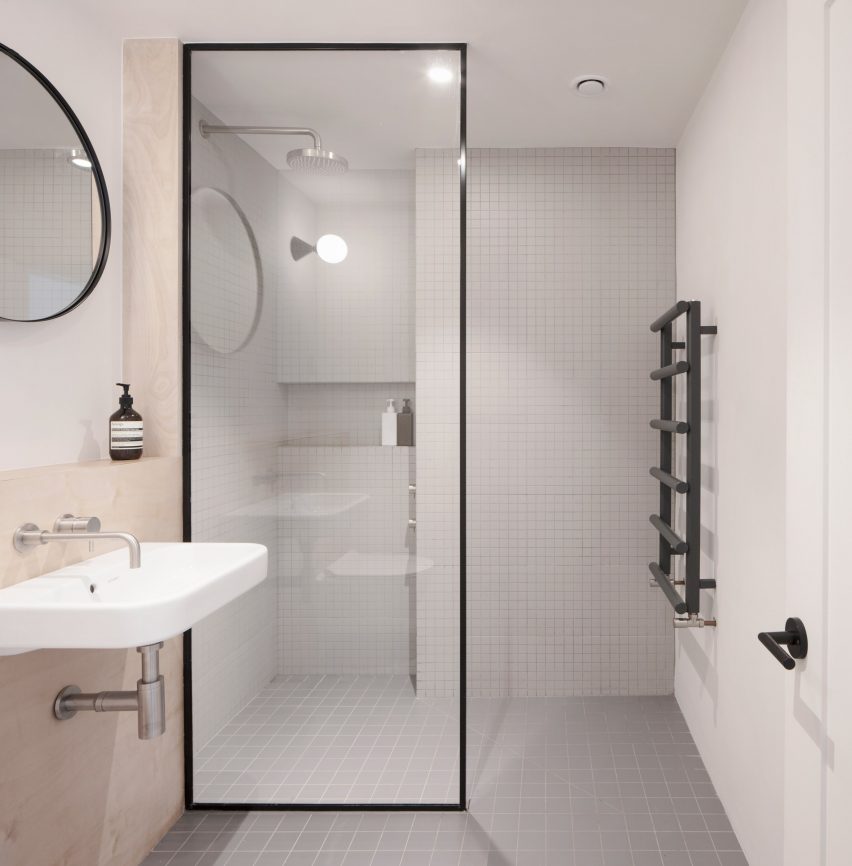
A sage-coloured set of stairs leads up to the home’s first floor, where the practice has mostly worked to restore original features like the cornicing, window shutters and ornate fireplace in the master bedroom. The bathroom has also been updated to feature gridded tile surfaces and a graphic, black-framed shower screen.
Architecture for London was established in 2009 and is headed up by Ben Ridley.
It isn’t the only practice that’s designed a residence in reference to the client’s job – Lim + Lu decked out a Hong Kong apartment with brightly-hued furnishings to suit a young fashion designer.
Elsewhere, Dan Brunn painted surfaces inside an LA home white like a gallery to accommodate the ever-changing art displays of its owner, an illustrator.
This feature was originally published in dezeen.com.


