Locus: Proposal by Maden Group
On the recent publication from the Department of Urbanism and Environmental Protection of the Municipality of Peja on the winners of the competition Peja City Center, Maden Creative Studio held the third place. This studio`s design approach named Locus, or the center of activities or power, not only merges the architecture with the overwhelming natural beauties the city of Peja hosts, but also redefines this part of the city as the center of all future activities. Below you may find the studio`s design description and exclusive presentation renderings.
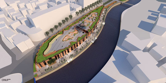
The complex is designed with the appropriate connection between urban planning, architectural design, city landscape, human being and nature. A simple integration in nature without harming it. So the complex is created considering the light, air, water, heat and renewable resources. Building Facade is inspired by the rhythm of trees and realized through the combination of glass and brown brick. In order to emphasize the human approach to designing this complex, different “inviting” activities were designed: businesses, promenade by the river, cafés, resting and reading and cycling areas, “panoramic frames” and viewing points with binoculars to watch out that are located in the green area set up on the roof. So this area it will be a common ground for people where they could buy something, meet someone , sit and read a newspaper, enjoying the panoramic sights, the sound of the river, the noise of people moving from the “korzo” and promenade along the river, having at the same time in mind the idea of being in the city center.
The facades are chosen in such a way that at the side of the road they are organized with a regular pace, while at the side of the river are slightly irregular, combined with larger openings to allow and create a sense physical or visual connection to the river “Lumbardh”. The concept of this complex originates from the needs of the site and gives great importance to its design details. Besides the facade having resemble a bar-code to symbolize identity, inspired by the existing green spaces are designed and highlighted entries, as well as designed fences and railings that have a distinctive feature since in itself entail the flower of the tulip as a flowers very common and common throughout the country and especially in the city of Peja. In the same spirit are designed the advertising holders of each store and street lamps.
Regarding the need for the greenery to be present in this area, it is thought that the architectural structure will allow and is going to hold the greenery on the top, and everywhere where it has been possible in the context of broader urban, existing greenery is maintained near the Ura Hekurit, even a location within close it has been stored. In the two-dimensional plan of the area looked from the top, it’s given the feeling that there is any impact-physical intervention (building) there. While the facades of the building, inspired by existing greenery located in the Little Park, has become a reflection of the existing trees on them (the facades). This generates the appearance, the shape of this building. Vertical, clear and straight lines, set in the facade, are parallel to the trunks of trees, where the woody part is made of brick lines and air it evolves in the glass that allows transparency. Both of these materials, are presented as a bar-code, creating Peja`s new identity.
The brick, as a main cladding element in construction anywhere and also in this country over the centuries, is thought to be brought back in time in harmony with the modernized buildings already built in Peja. The brick facade conveys the spirit of the time in which the object is being built, but at the same time it sufficiently respects the architecture and the environment city of Peja. This is easily achieved by combining this type of facade with large opening glass structure to allow the passage of light and transparency, but also reflect the country’s architecture and its environment. Also, these two materials work well in terms of functionality and configuration of necessary spaces, contributing to the shape and identity of the building as whole. This creates an innovative architecture, while allowing the utmost use on the size of the businesses, which in the tridimensional context comes and appears as a barcode to give a new identity to the city’s new urban fabric and its center.


